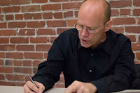
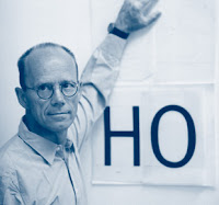
 With numbers there are more restrictions, and there’s more freedom at the same time. You look at some typefaces and you wonder where the numbers came from. The truth is, they were probably added later. There is a sort of generic set of numbers that can always be integrated into almost any typeface. If you look at the Century School font, for example, that’s the sort of generic – especially American – typeface of the 1800s. It has a specific set of numbers, but you could put those same numbers into almost any other typeface and they wouldn’t look out of place because numbers have their own shapes, different from characters; they’re standing alone anyway. So there’s actually quite a bit of leeway because they only have to conform to each other. The weight has to be kind of the same: the 1 has to look like a 1; the 4 like a 4, but not necessarily like the A or the B. That’s the weird thing.
Saturday, April 4, 2009
 With numbers there are more restrictions, and there’s more freedom at the same time. You look at some typefaces and you wonder where the numbers came from. The truth is, they were probably added later. There is a sort of generic set of numbers that can always be integrated into almost any typeface. If you look at the Century School font, for example, that’s the sort of generic – especially American – typeface of the 1800s. It has a specific set of numbers, but you could put those same numbers into almost any other typeface and they wouldn’t look out of place because numbers have their own shapes, different from characters; they’re standing alone anyway. So there’s actually quite a bit of leeway because they only have to conform to each other. The weight has to be kind of the same: the 1 has to look like a 1; the 4 like a 4, but not necessarily like the A or the B. That’s the weird thing.

it’s always a challenge to give numbers space, because you need to create a complete set where each figure takes up the same amount of room: The 1 has to be as wide as the 0 so that when you make tables they arrange. It’s just another design challenge. I don’t do a lot of designing or drawing myself anymore because there are people who are much quicker than I am, but the numbers I always do myself because I like them so much, even though I probably spend way more time than I should. They’re just too pretty.

In 2006, Design Within Reach commissioned Spiekermann to design house numbers; a three-dimensional typographic challenge. The result was four carefully-considered choices of number sets, including Tech, which had no diagonal strokes. If letters are his friends, then numbers are difficult, beautiful women that flirt a lot but rarely behave. Spiekermann shared the challenges and history of number design, in person, on April 23, 2008:
"Anybody can design letters, but numbers are hard. Tech was an interesting challenge that I gave myself: to create a typeface that has no diagonals. When you design numbers, you have to do ABC at least. It’s interesting because I realized that what worked for the house numbers obviously doesn’t work for letters. This was going backwards. But numbers and letters are very different; they have different space, different shapes; they come from different places. Figures are actually my favorite part of type design.
 Erik Spiekermann has been designing typefaces and information systems since the early 70s. He is a founder of the German mega-firm MetaDesign, and FontShop, the first online distributor of digital fonts. If you’ve ever used typefaces such as Officina or Meta, traveled on Berlin transit, or read the Economist, then you know Spiekermann’s work. And if you saw the 2007 documentary, Helvetica, then you surely remember the self-professed typomaniac: “They [letters] are my friends… Some people look at bottles of wine, or whatever – girls’ bottoms – I get kicks out of looking at type.”
Thursday, March 26, 2009
Saturday, March 21, 2009
Erik Spiekermann
Erik Spiekermann was born May 30, 1947. He is a German typographer and designer. He is a professor at the University of the Arts Bremen.
Spiekermann studied art history at Berlin's Free University, funding himself by running a hot metal printing press in the basement of his house.
FSI FontShop International was founded in Berlin in 1988 by Erik Spiekermann and Joan Spiekermann, who were then husband and wife, the first mail-order distributor for digital fonts. FontShop International followed and now publishes the Font range of typefaces. MetaDesign combined clean, teutonic-looking information design and complex corporate design systems for clients like BVG (Berlin Transit), Duesseldorf Airport, Audi, Volkswagen and Heidelberg Printing, amongst others.
